
Today, it was warmer. The snow still covers my garden but much of the snow has melted away. Soon, the deep freeze will return. The garden is still a distant dream.
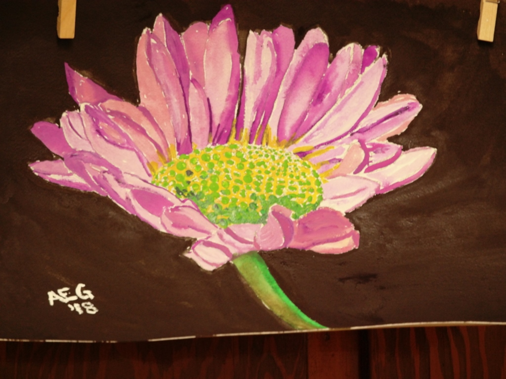
Last Thursday, I went to Stella Niagara for a painting class. It was the first of a two-week floral painting series. Last week, we painted flowers with a black background.
This was my illustrated story about painting a flower with a black background.
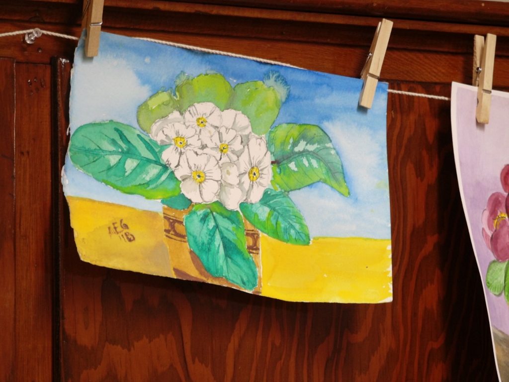
Today, we painted primroses. Primroses are small plants with large leaves and flowers in a variety of colors, including yellow, red, white, pink, and more. Primroses are native to Europe and Great Britain. They are especially common in Devon, in southwest England. Primroses like to grow in damp places. Hence, they will do well in Grand Island, which is full of wetlands.
I was able to take a plant home with me. In the spring, the plant will go into my garden.
So… the painting.
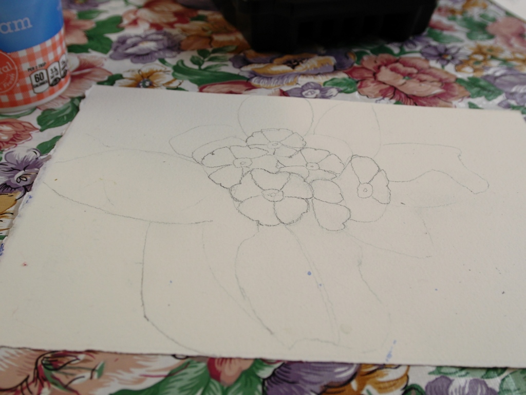
I started with a quick sketch of a primrose plant in a pot.
The first things that I painted were the leaves. To make leaves look more three-dimensional, it is helpful to use a variety of colors. I used two different shades of green and a small amount of yellow. To make the green look darker, I added a little red.
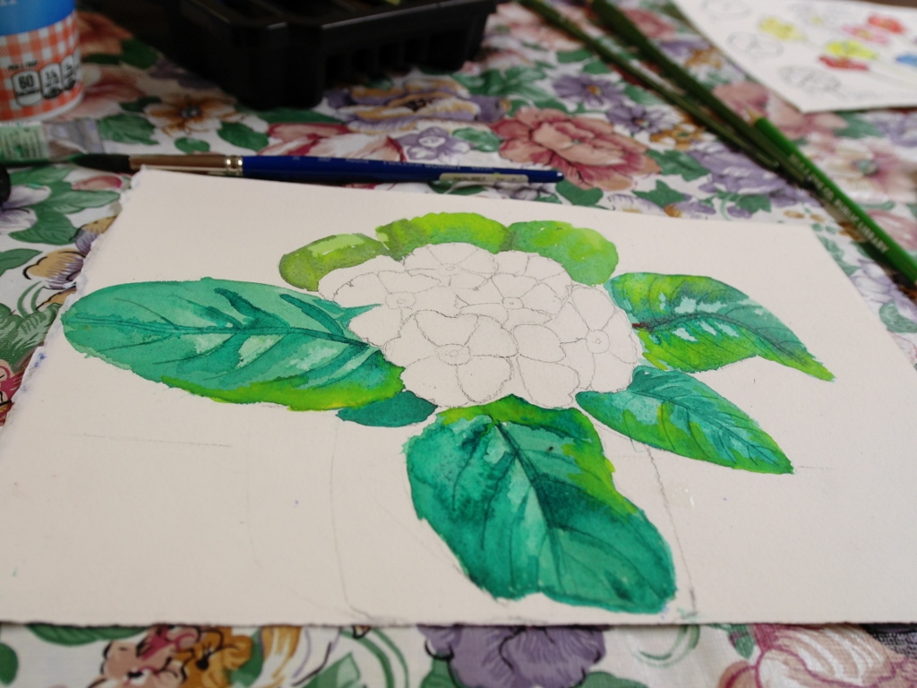
When you add red to green, you are adding a complementary color, with the purpose of making the original color (green) look darker.
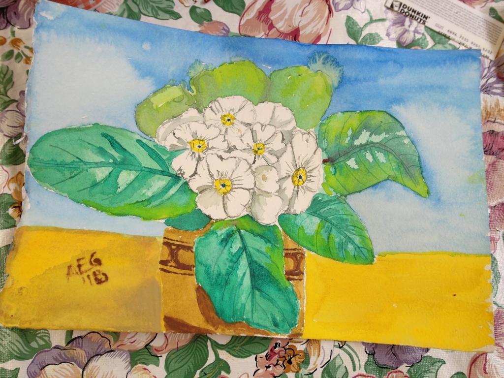
Once the leaves were painted, I used a blow dryer to get the painting completely dry. I then went on to painting the flowers. In a primrose, in the very center of the flower, there is a green dot. Around that green dot is a bit of yellow. At this point, I had to decide what color I wanted to paint the flowers. I chose to keep my flowers white. When you keep your flowers white, you still have to add color to the flowers to show that there are shadows on the flowers. I wanted my shadow to be a chromatic neutral, which looks gray. A chromatic neutral is created by mixing equal parts of two complementary colors. Because I had quite a bit of green in my painting, I chose green and red as the complementary colors.
 After I finished painting the flowers, I dried the painting and then proceeded to paint the flower pot, the table, and the background. Once I finished adding a decorative touch to the flowerpot, the painting was complete.
I like that brown color as background! It sets it off well. If I'm saying that right, LOL. Nice to see the picture again!
that is beautiful..loved both the flower paintings you have done and waiting for more from that garden
Alice, I love the colors in your paintings and the three dimensional effect of leaves look great.I have learnt acrylic painting and my house is filled with canvases of various shapes and sizes 🙂 I have painted in the corridor outside my flat and the wall is a riot of colors. My neighbor loves it and the visitors to our flats compliment me on the artwork :)I know they are being kind because I am just an amateur 🙂
Your paintings are beautiful. I find flowers really hard to paint. I guess I should practice more.
Again, another lesson in paints and painting.
So much for the value of paint night- they teach none of that!
This looks really beautiful! Like Suzy, I also find flowers hard to paint – I prefer to keep them looser and more abstract!