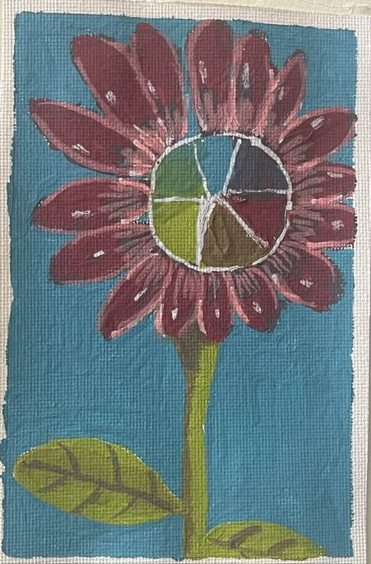
In today’s blog post, I’m going to talk about four color-related things. I made another painting with the matte pastels on canvas, and I attempted to create a color wheel within the center of the flower, but it really didn’t work well. Which is okay. The goal of daily practice is to sharpen skills, not to create a masterpiece each day. I personally don’t know of anyone who could do something like that. Plus, setting the goal of a daily masterpiece would add so much stress and subtract so much fun. And why do something that doesn’t bring you joy?
That’s where doodling comes in. Usually, you doodle for the sheer enjoyment of it. And you usually start by drawing the doodles. Sometimes, you doodle when you listen to a lecture. Or you might doodle at a meeting. It helps focus your attention. I find it easier to listen to the proceedings of a meeting when I’m doodling. And then, later, I look at my doodle. Usually, it ends up in the recycle bin, but there have been times when i’ve turned what appeared to be a random doodle into an actual painting. And, of course, it’s in color.
Which brings me to the color wheel. I put one in the center of the painting. My yellow was too green and my blue had a lot of green in it. So, when I talk about things on the color wheel, you’re going to have to use your imagination because the colors aren’t totally right. Well, here we go:
1– Complementary colors: These are colors that are opposite on the color wheel. One would be a primary color, and the other would be a secondary color. There are three sets of complimentary colors. They are blue and orange, yellow and purple, and red and green. They tend to look really good together. They look vibrant and alive and that adds appeal to paintings.

2– Chromatic neutral: when you mix complimentary colors together, they tend to cancel each other out. You end up with something that looks gray. That’s called a chromatic neutral. Even though it looks gray, it’s a better choice than using gray paint. The chromatic neutral has elements of the two colors that you’ve used and so, it blends better with the painting. Plus, your chromatic neutral most likely won’t be a perfect gray because the level of balance between the two complimentary colors (let’s say, purple and yellow) is difficult to achieve. And the fact that it’s not a perfect gray is a good thing because you can see a bit of color and that blends with your painting all the more.

3– Contiguous or analogous colors: These are colors that are next to each other on the color wheel. For example, yellow and green, green and blue, blue and purple, purple and red, red and orange, and orange and yellow. They look nice together. While complimentary colors look vibrant and alive, contiguous or analogous colors give a sense of harmony or tranquility. The effect is of restfulness, as opposed to contrast.

4– about primary colors: They are just there. You cannot create them by mixing two colors, like you can with secondary or tertiary colors. They exist everywhere. You could look for them in nature, and you will find them. This could be a fun activity to do with kids or with anyone who wants to know more about art. Take a walk in a garden or a forest and look for the colors. When you find something that’s a primary color, write it down in a little journal. You could even do this as a contest to see who finds more colors while out on a nature walk. When you get back home, tally up how many object of each color you have. The winner gets a prize.
In reality, though, everyone who participates in the activity wins because it gives you an opportunity to look at nature in a different way.
See you tomorrow! I will have a picture and a story for you!

Alice, I love color. Your painting at the top has rich, sultry colors, and I love it. Thanks for the review of color relationships.
Thank you, Kebba! I love dramatic colors! And I enjoyed writing about color relationships because it was a review for me, too.
I love the red flowers – they made me happy!
Donna: Click for my 2025 A-Z Blog
Thank you, Donna. I am happy that the flowers brought you happiness!
Hi Alice,
When working with lights, like playing with colours on a computer screen or lighting a stage with spotlights, the colours work differently.
The primary colours are Red, Green and Blue. When they are all added together the colour generated is WHITE.
Adding red and blue lights the stage with yellow.
That’s really interesting to know how the colors work when lighting stages or on a computer screen. I’ve performed in all sorts of productions and I’ve made props and I’ve helped with costumes and scenery, but I’ve never done much with lighting. To me, it was just magic, so thank you for demystifying it for me!
Hi Alice.
I meant to say Red and Green make yellow. (not blue)
That’s is so interesting because you won’t ever get that effect from paints. I guess stage lights work differently!
love this series.. and that first painting (well, all of them actually) is amazing
Thank you, Vidya. I am so happy that you’re enjoying this.
Wow, this is so informative! I remember being delighted as a child when I realized that using a yellow crayon on blue gave me green color. The shades changed depending on how much pressure I put on the crayon.
Great painting too, Alice. They are beautiful!
Thank you! I am super grateful.