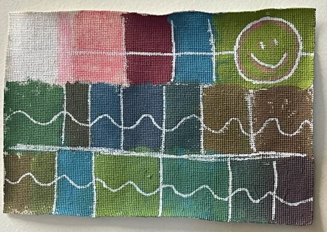
Three colors, to be exact. These three colors are turquoise blue, deep red, and lime green. So, instead of painting an image, I chose to do a paint-mixing experiment. I wanted to mix them to see how many colors I could create. Although I am sure that I could have created many more shades by mixing these colors, I am happy with what I did. It was a fun experiment. The white is a Copic marker (snow white), and the pink is a pigment real brush (rose pink).
Well, so the color mixing. These aren’t really all completely primary colors. The deep red, yes. But the turquoise blue is a blue mixed with green (typically phthalo blue and phthalo green), and the lime green is a green mixed with yellow (it could be cadmium yellow mixed with Prussian blue). Which means that, even though there is no pure blue or no yellow paint, I do have every primary color represented in this group. And that’s fun for me because it means that I have far more than three colors to work with.

I really love color. Several years ago, I took a class in color theory at the Partners in Art studio in North Tonawanda, N.Y. The class was taught by Joan Horn, one of the two artists who owned the studio at the time (Glenna Sternin, the other artist who co-owned the studio, has recently passed away. She was a gifted artist and a truly wonderful person, and she is very much missed). Joan taught us about many things: complimentary colors, contiguous colors, primary colors, secondary colors, tertiary colors, and much more. With that information, you can create your own color wheel. You start with primary colors (red, yellow, and blue) and leave big spaces between them. Then you add your secondary colors, which are two primary colors mixed together to create a third color. So, red and yellow mixed together make orange, yellow and blue mixed together make green, blue and red mixed together make purple. To get tertiary colors, you will mix together a primary color plus a secondary color that’s next to it to get yet a different color. So, for example, purple and blue create one version of purple that’s closer to blue, while purple and red would create a shade of purple that’s closer to red.
I think that color theory is very cool. In the class that I took, we had the opportunity to do a lot of color mixing with just three tubes of paint. I did learn in this class that it is possible to create a wide variety of colors with just a few paints. One of the really great aspects of this class is that Joan demonstrated mixing three colors on a painting that she was working on, as the class unfolded each day. The class always started with this really interesting demonstration. And because there were only a few paints that were mixed to make more colors than I ever thought possible, the colors in the painting looked really good together.
Tomorrow, I’m going to paint an actual image, and I will continue the discussion of color to include complimentary colors, ambiguous colors, and chromatic neutrals!

Thanks Alice, I am looking forward to the art classes.
You’re welcome!!!!
I like your happy color swatch. Thanks for sharing.
You’re very welcome! Thank you for visiting!
Alice, I loved your playful approach to color—it’s amazing how much possibility can come from just a few shades. Your passion and curiosity are so inspiring.
thank you so much. It was fun!
I look forward to your next post!
Donna: Click for my 2025 A-Z Blog
Donna, thank you so much!!! I’m going to read your blog now!
Woo, that’s a range of shades you got from three colors! This is fascinating. I love colors, though my preference lies in deep dark colors rather than pastels, but all are beautiful! Going to follow your series for the month. 🙂
Thank you so much!!!